
"Parasite Kitchen" was a collaborative project realized in partnership with the Kunsthalle Mannheim, Deutscher Werkbund, and the Faculty of Design of Hochschule Mannheim.
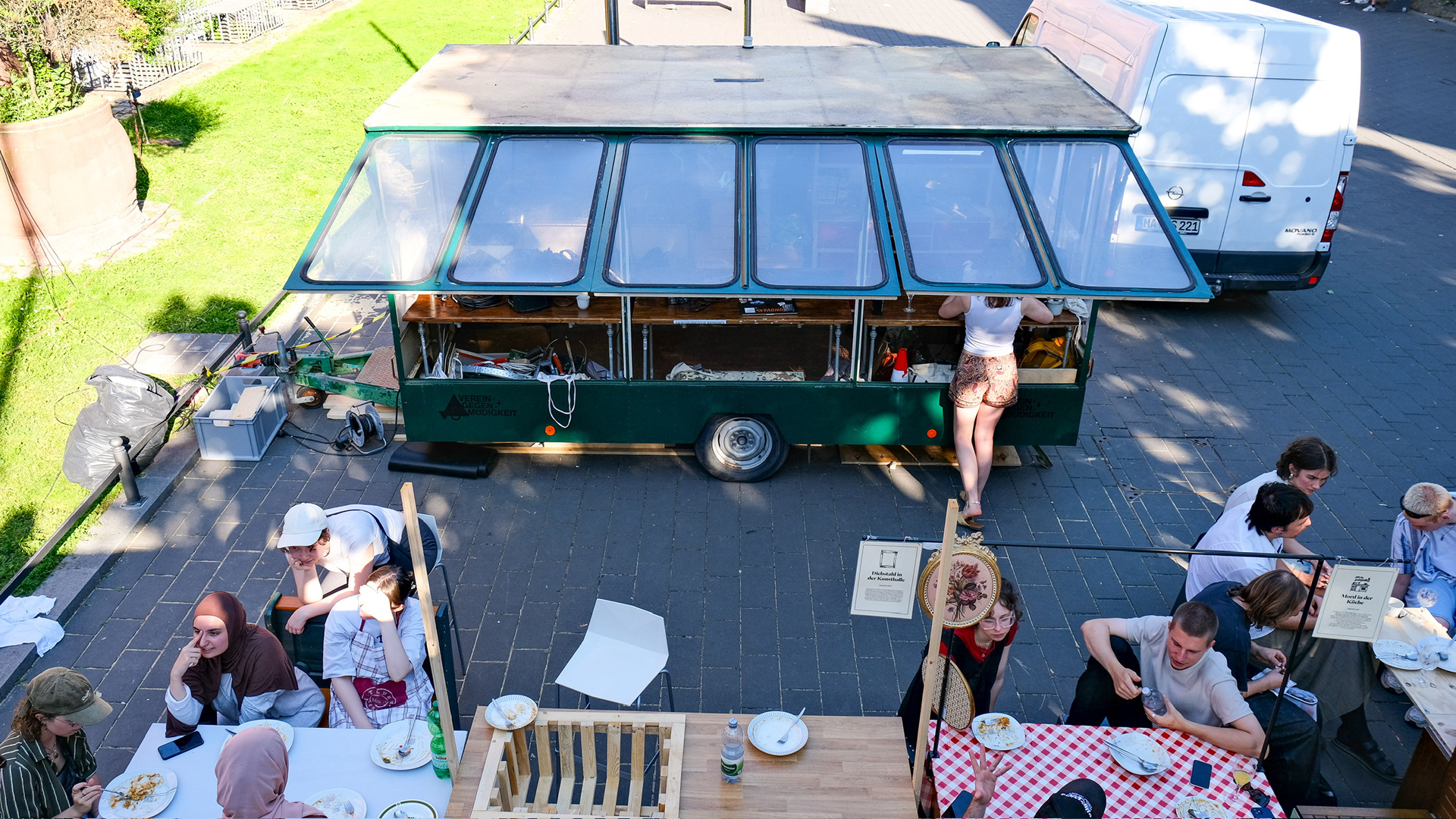
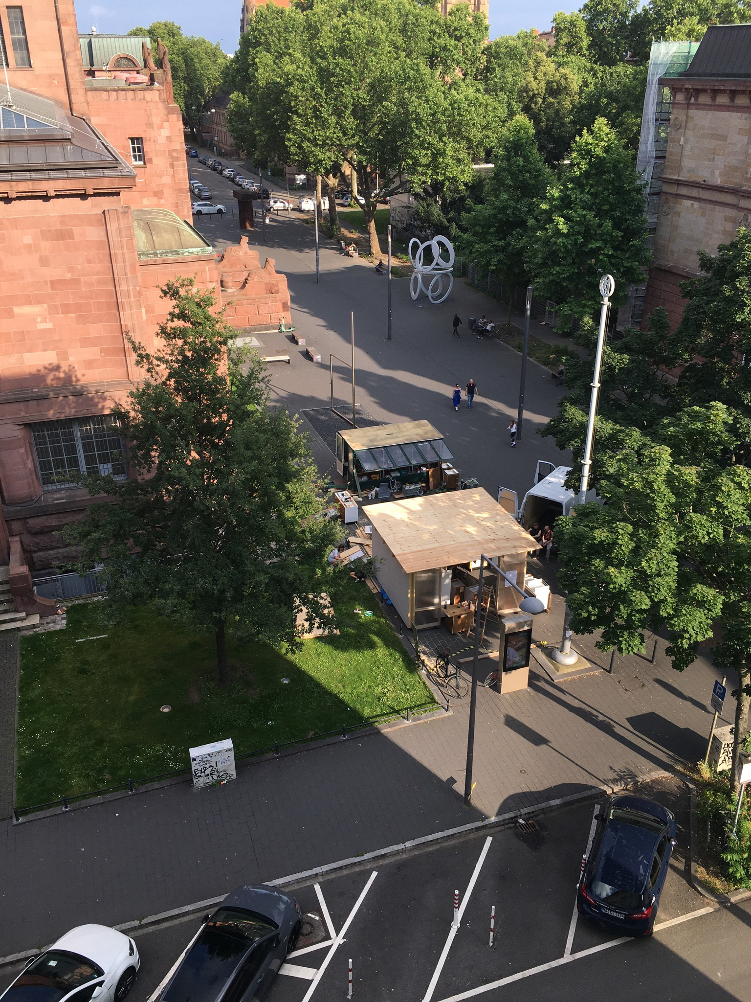
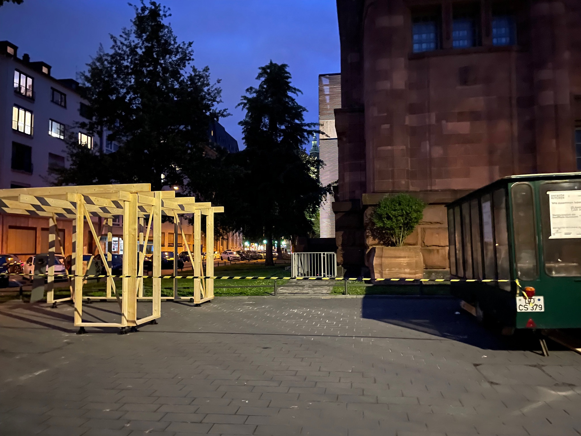
In the summer of 2024, we built a fully functional kitchen in Skulpturenplatz, Mannheim. The themes of "How to Live Together", the course from which this project originated, were meant to naturally unfold within the intimate space of the kitchen.
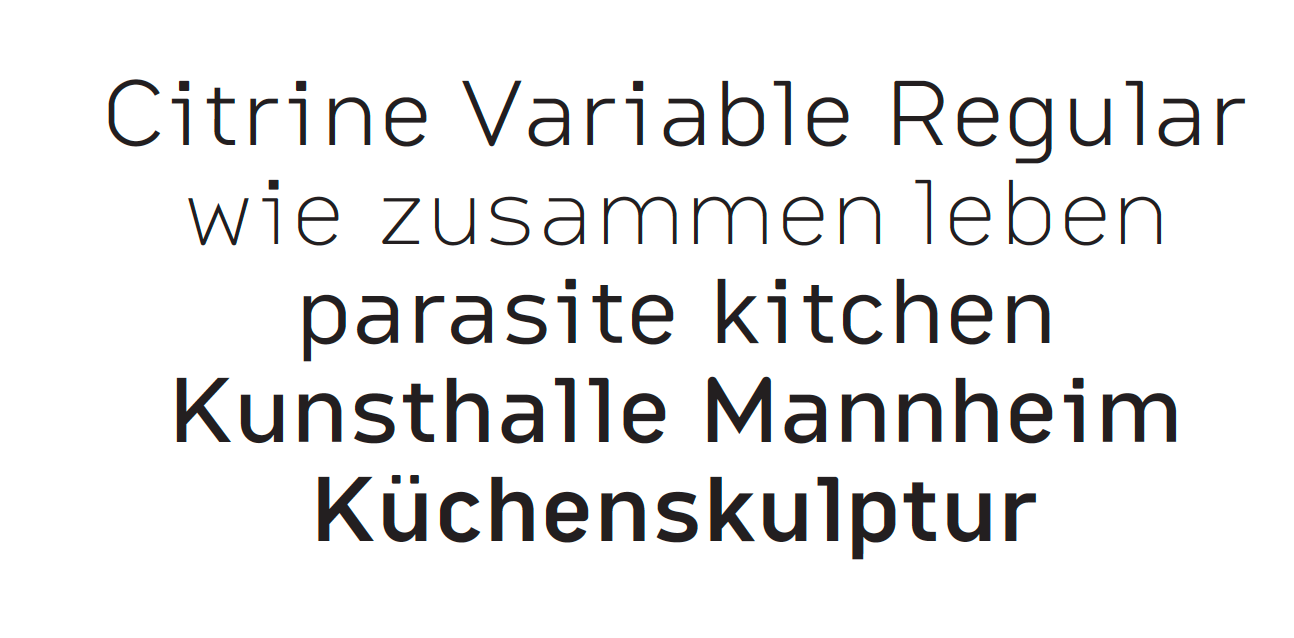
The Citrine Variable became our body text font. Its serifs evoke the typefaces of typewriters, and its x-height makes it highly legible even in long passages of text. It’s the perfect alternative to traditional monospace fonts.
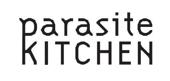
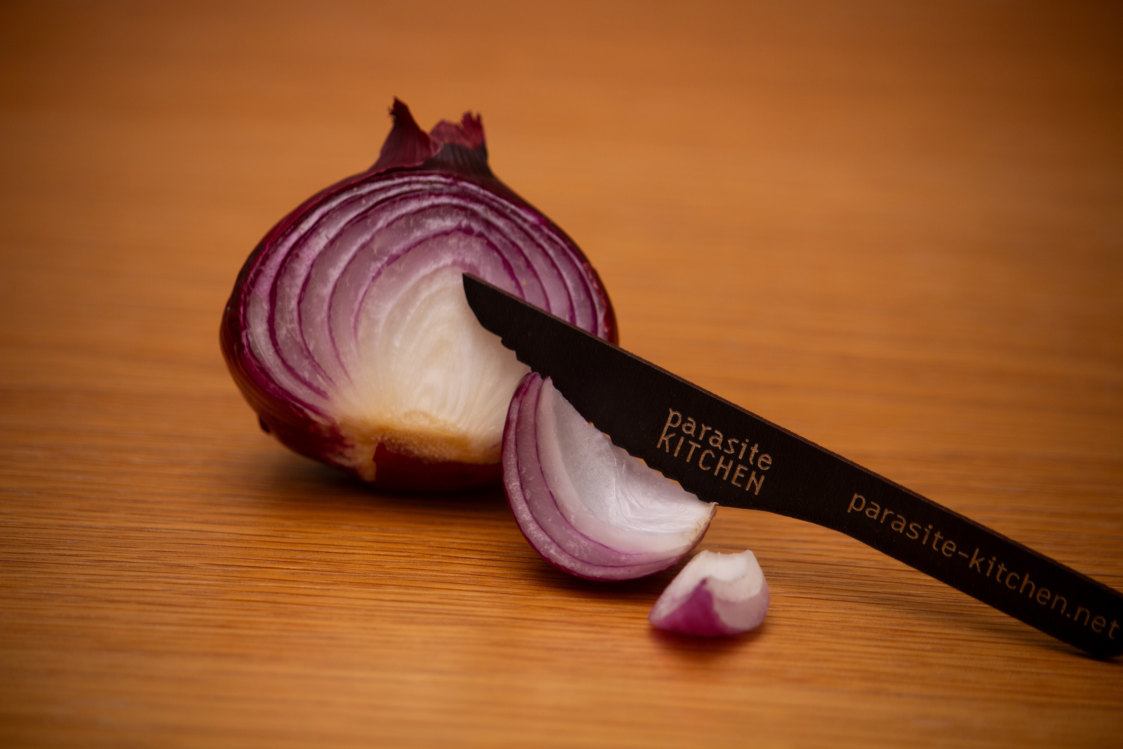
It quickly became clear that the parasite kitchen needed a wordmark! For the website, posters, and our business cards—a simple wordmark with strong recognition value. The challenge was to ensure that "parasite kitchen" didn’t resemble a restaurant, which is why we decided for the Citizen OT, resembling a bit of a darker font, with letters that look as if they've been nibbled on by a parasite.
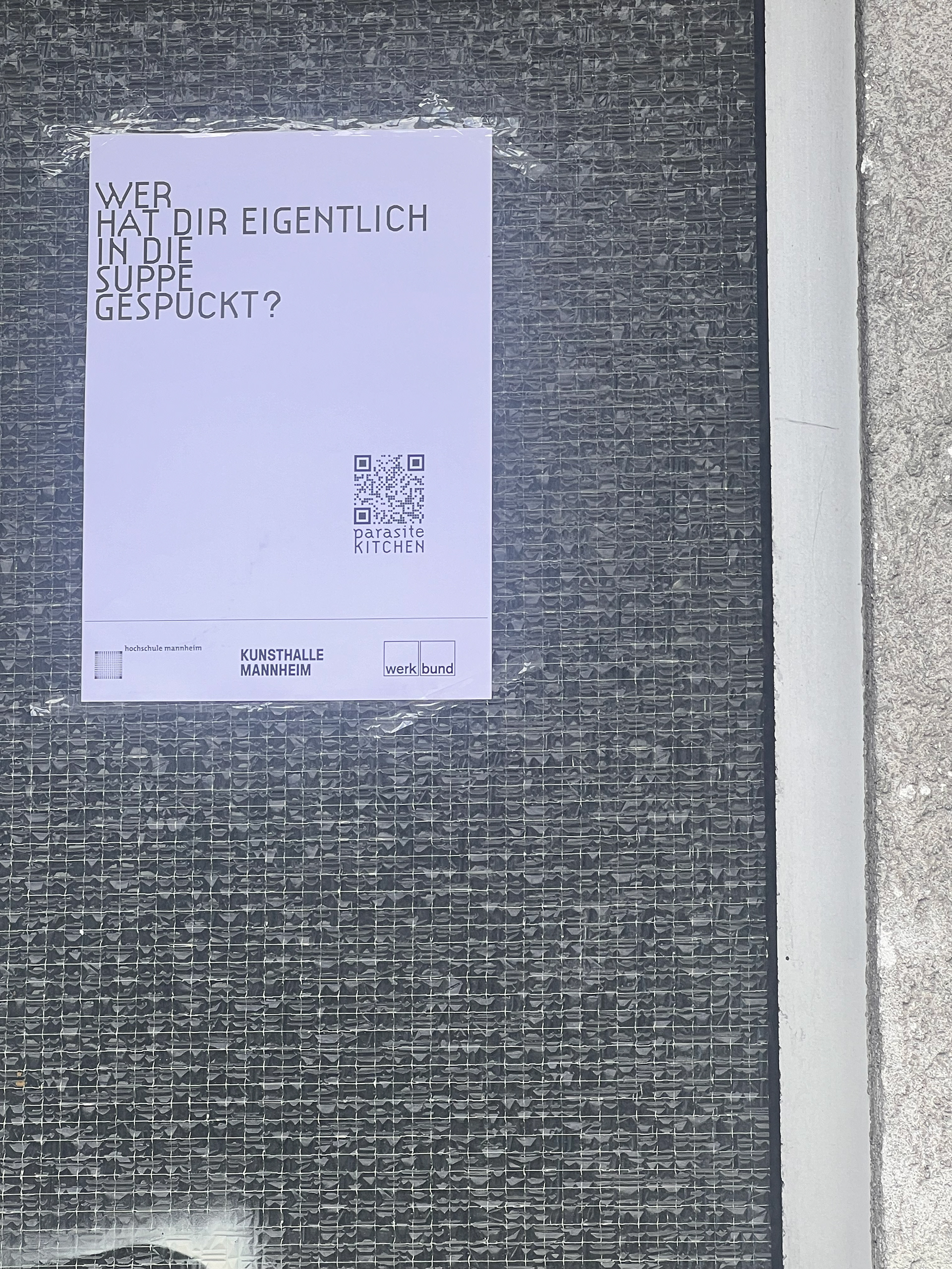
Next, we moved on to promoting the project! For this, I developed a series of posters and business cards. The design of the posters remains simple and clear—the topic is complex enough. Anyone drawn to "Parasite Kitchen" or the theme of "How to Live Together" can find more information on the website or know when and where to go. Knives, forks, and spoons—the three shapes on the posters are the same ones featured on our business cards.
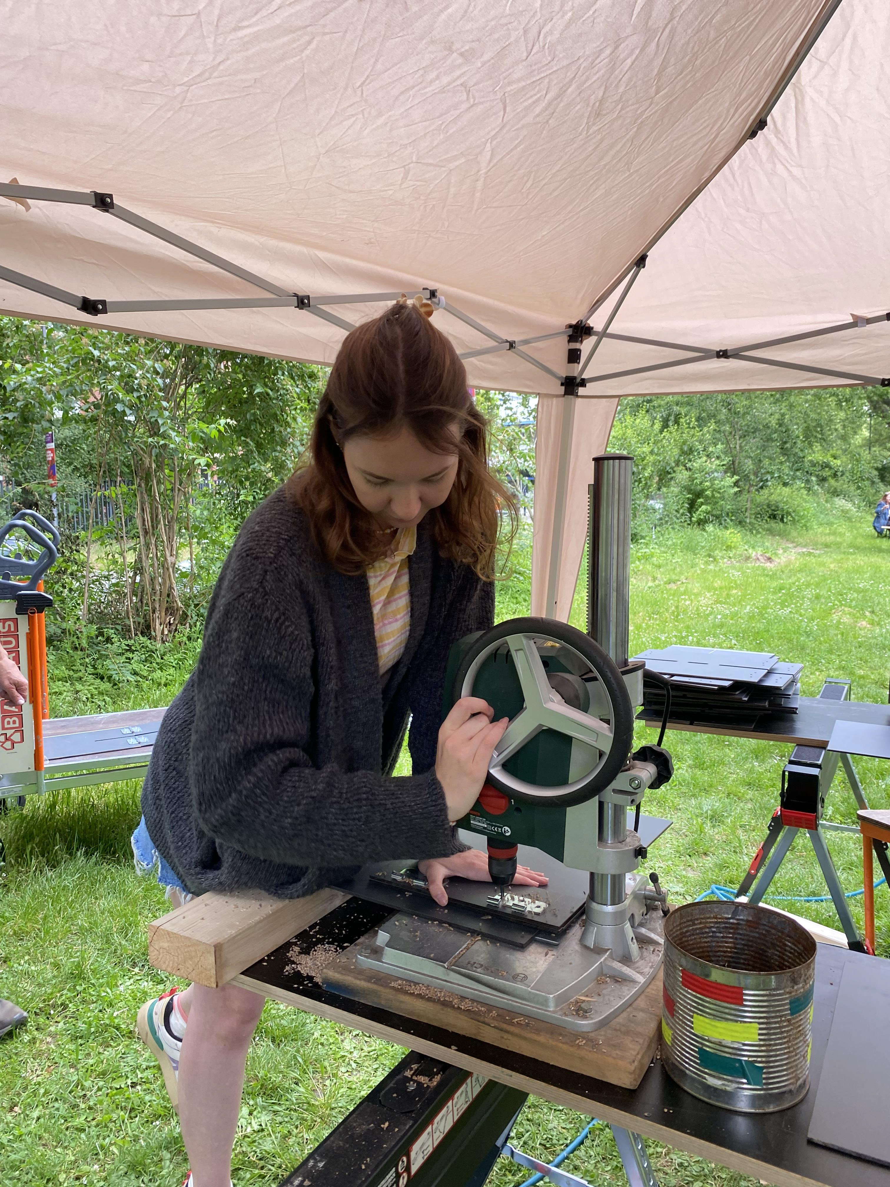
For the project, we collaborated with the "Verein gegen Müdigkeit" from Heidelberg to create stools made from repurposed table tennis boards.
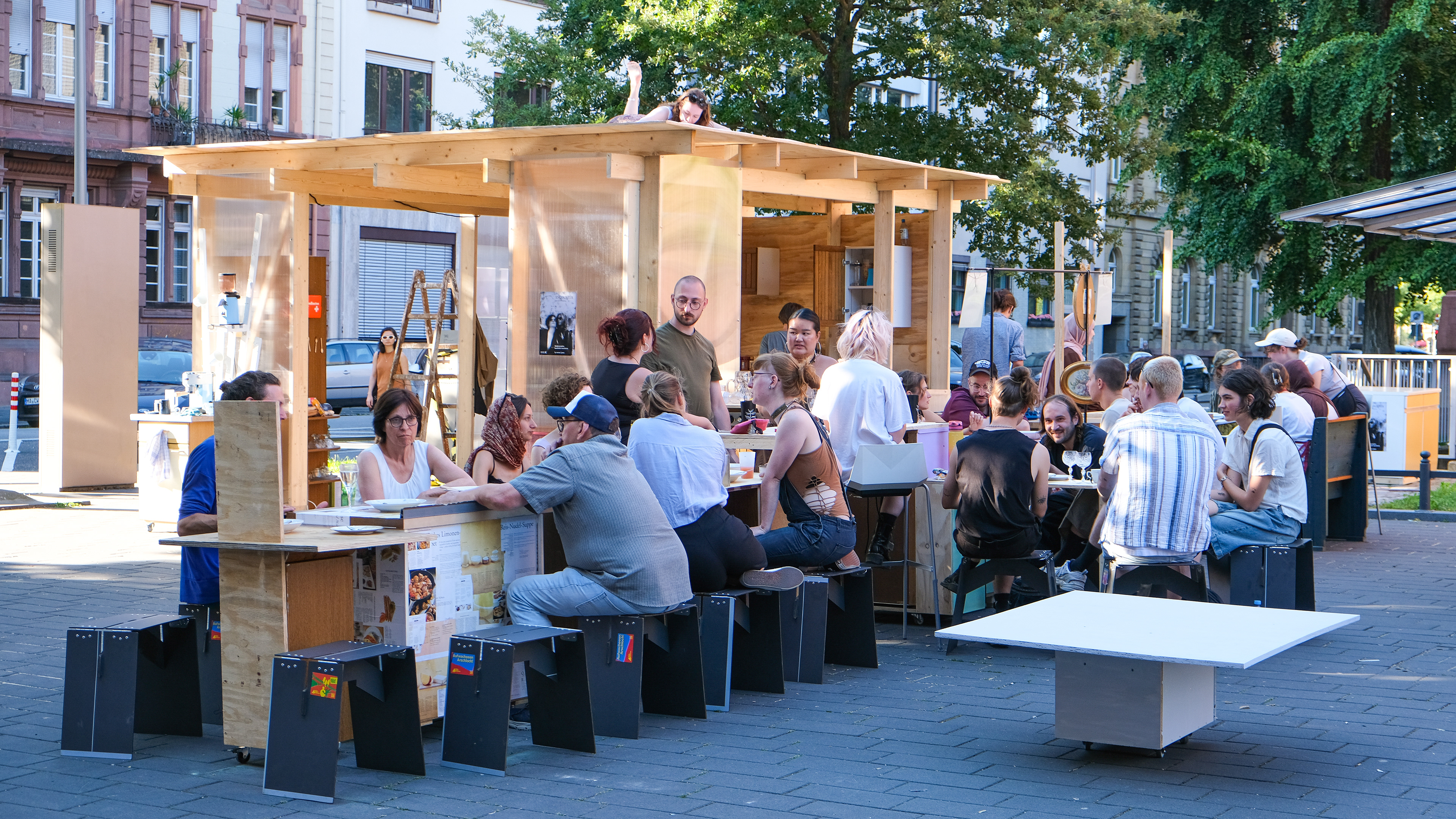
The parasite kitchen became a space for all residents of the city. In the intimate setting of the kitchen, hierarchies dissolved, and everyone met as equals. It was a place for discussing how to live together while cooking and sharing ideas. Above all, it was a hub for exchange, creativity, and community.